Brand Identity and Packaging Design // Client Project
Brand Identity and Packaging Design // Client Project
Indigo Life Brand Design
Indigo Life Brand Design

🙌 Overview
🙌 Overview
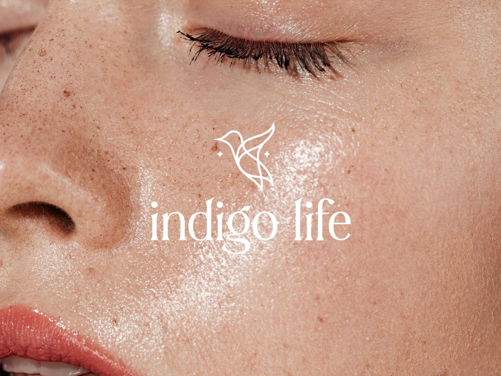
Indigo Life is a brand of women's health supplements established in Primrose Hill in 2024. Having worked together in the past, Oliver (co-founder) reached out to me and asked if I could design the brand identity for their new brand, Indigo Life.
Indigo Life is a brand of women's health supplements established in Primrose Hill in 2024. Having worked together in the past, Oliver (co-founder) reached out to me and asked if I could design the brand identity for their new brand, Indigo Life.
Indigo Life is a brand of women's health supplements established in Primrose Hill in 2024. Having worked together in the past, Oliver (co-founder) reached out to me and asked if I could design the brand identity for their new brand, Indigo Life.
💥 Challenge
💥 Challenge
The challenge of this project was to design a bold, yet elegant identity that would attract the gaze of the busy corporate millenial women. It also had to be different than most supplement brands currently on the market, and evoke a sense of community.
The challenge of this project was to design a bold, yet elegant identity that would attract the gaze of the busy corporate millenial women. It also had to be different than most supplement brands currently on the market, and evoke a sense of community.
The challenge of this project was to design a bold, yet elegant identity that would attract the gaze of the busy corporate millenial women. It also had to be different than most supplement brands currently on the market, and evoke a sense of community.
👑 My role
👑 My role
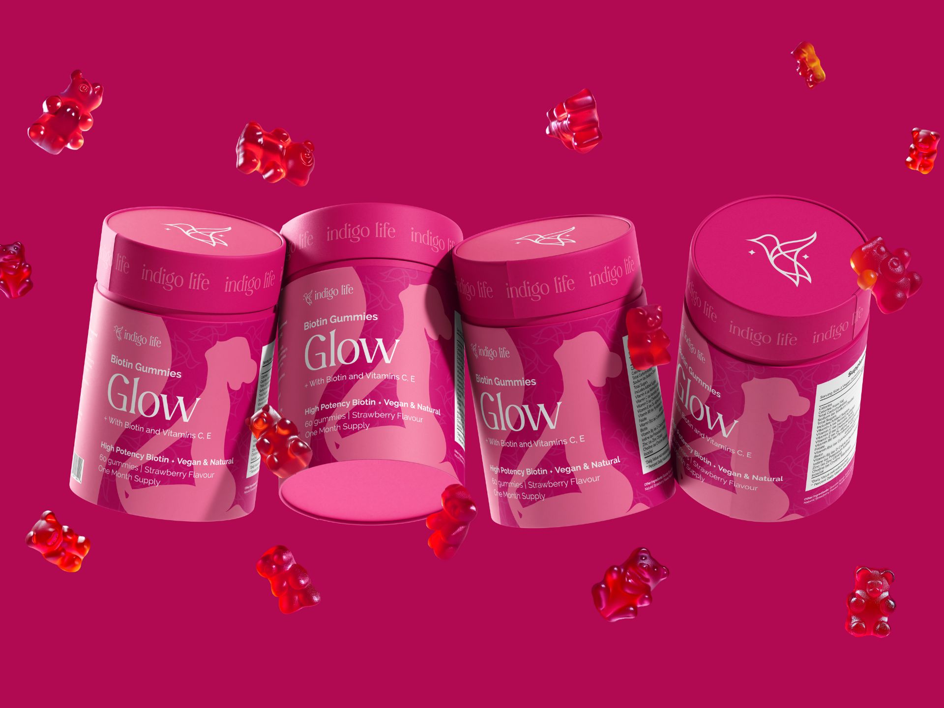
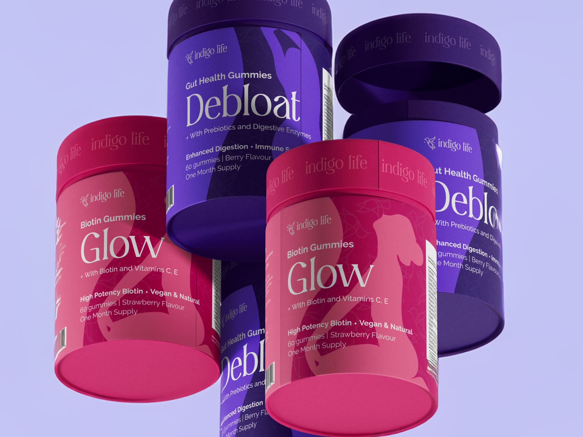
For this project I was initially contracted only as a visual identity designer. I delivered a full brand idendity (including logo suite, patters, icons, collateral). After the project was completed, the founders reached out again for the packaging design of their five products.
For this project I was initially contracted only as a visual identity designer. I delivered a full brand idendity (including logo suite, patters, icons, collateral). After the project was completed, the founders reached out again for the packaging design of their five products.
For this project I was initially contracted only as a visual identity designer. I delivered a full brand idendity (including logo suite, patters, icons, collateral). After the project was completed, the founders reached out again for the packaging design of their five products.
🧠 The Concept
🧠 The Concept
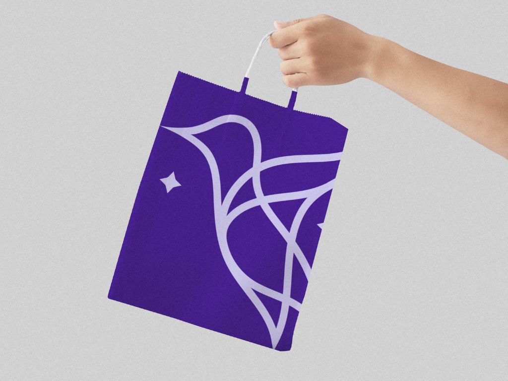
For this project I went for a delicate hummingbird symbol constructed with a continuous line. The hummingbird traditionally symbolises life, joy and healing, which aligns with Indido's mission of making women healthier and joyful in their own bodies.
For this project I went for a delicate hummingbird symbol constructed with a continuous line. The hummingbird traditionally symbolises life, joy and healing, which aligns with Indido's mission of making women healthier and joyful in their own bodies.
For this project I went for a delicate hummingbird symbol constructed with a continuous line. The hummingbird traditionally symbolises life, joy and healing, which aligns with Indido's mission of making women healthier and joyful in their own bodies.





✒️ Typography
✒️ Typography
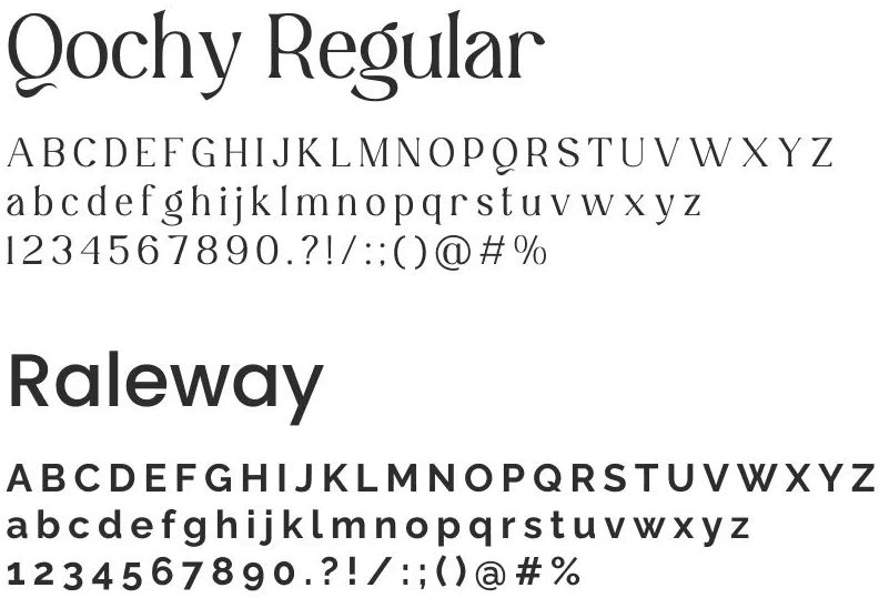
During our discovery call, both founders expressed a desire for an identity that is more elegant and feminine. After presenting three moodboards, we unanimously agreed on a direction featuring a luxurious modern serif font. Consequently, I chose Qochy Regular as the primary font for the brand.
Because the primary font was so intricate, the secondary font had to be more simple and subtle. I went for Raleway, an elegant sans-serif typeface family, due to its versatility.
During our discovery call, both founders expressed a desire for an identity that is more elegant and feminine. I created 3 moodboards, and we unanimously agreed on a direction featuring a thin, luxurious modern serif font. I chose Qochy Regular as the primary font for the brand.
Because the primary font was so intricate, the secondary font had to be more simple and subtle. I went for Raleway, an elegant sans-serif typeface family, due to its versatility.






🎨 Colour Palette
🎨 Colour Palette
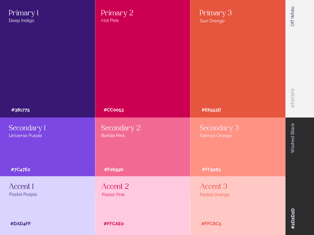
After conducting some competitor analysis, I noticede that the most frequently used colours in the women's supplement sector are white in combination with pastel colours. To achieve a distinctive feel, I opted for a bold palette with nuances to create contrast and allow for interesting compositions. The colour "Indigo" was an obvious choice, because of its significance the name of the brand.
After conducting some competitor analysis, I noticed that the most frequently used colors in the women's supplement sector are white combined with pastel colors. To achieve a distinctive feel, I opted for a bold palette with nuances to create contrast and allow for interesting compositions. The color "Indigo" was an obvious choice because of its significance to the brand's name.
