UX Design // University Client Brief Project

UX Design // University Client Brief Project

Rethinking access to Ford's subscriptions

Rethinking access to Ford's subscriptions

🙌 Overview

🙌 Overview

This project was part of my UX design course during my MSc Marketing programme at the University of Manchester. We received a brief from Ford UK, asking to redesign their Subscriptions page and the user journey associated with it. We were mentored by Senior UX Designers at Ford.

👑 My role

👑 My role

This project was completed over a duration of 3 months. I conducted UX research and utilised it to inform my UI design decisions. After completing the challenge, I asked one of Ford's senior UX designers for feedback. I was happy to see their response: "This is amazing! Great work on this. This is something to be proud of for sure!"

⚠️ The Problem

⚠️ The Problem

Ford’s Subscriptions page is currently facing low awareness among electric vehicle (EV) owners due to its difficult and counter-intuitive access. Furthermore, the page's frustrating navigation and lack of clarity is deterring potential EV owners from exploring subscription options.

🧠 The Solution

🧠 The Solution

My goal is to redesign the page to improve its visibility, accessibility, and user experience, thereby encouraging engagement and satisfaction among EV owners.To address the issues, the solution was threefold.


1️⃣ First, the information architecture of the Ford website was improved to enable easy and intuitive discovery of the Subscriptions page.


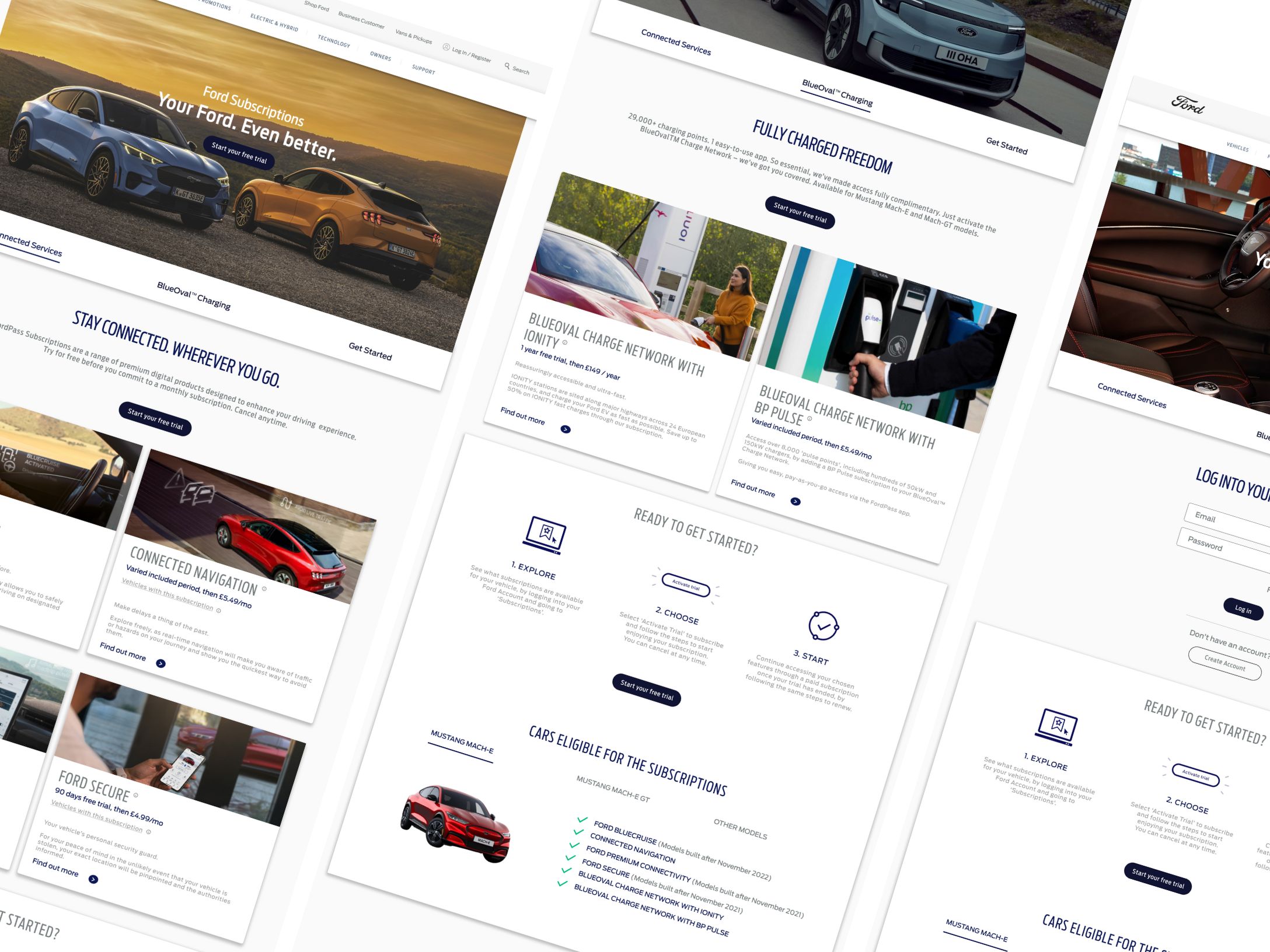
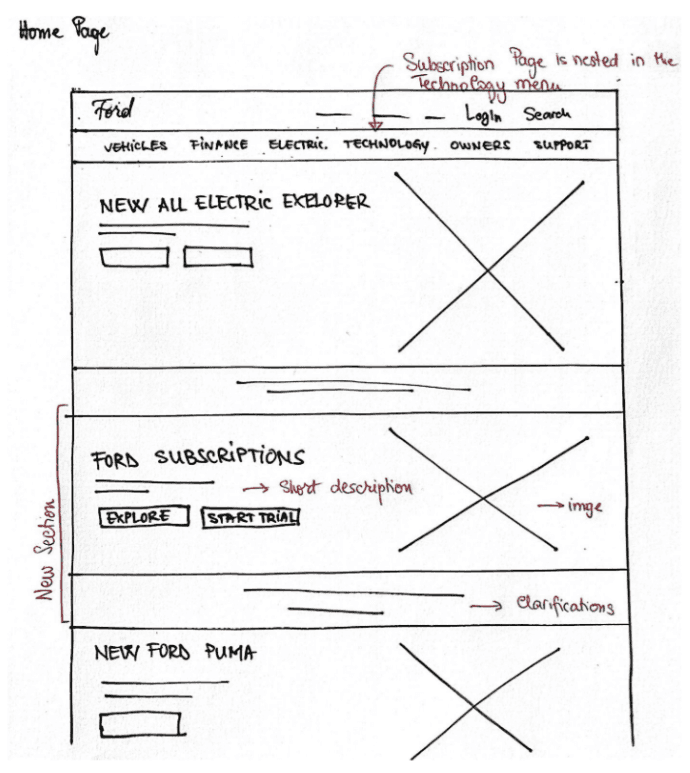
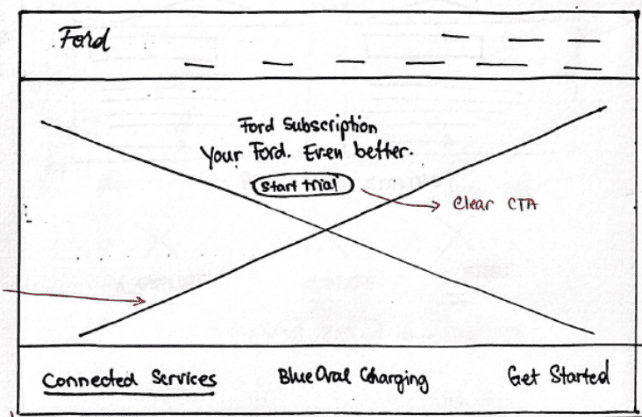
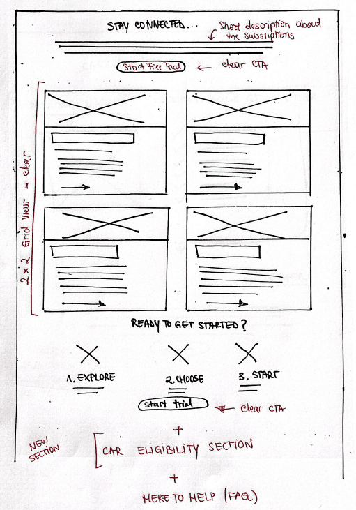
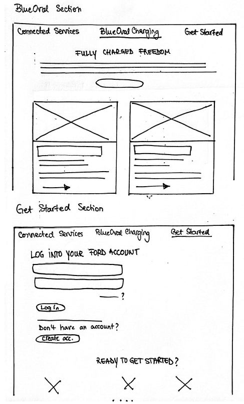
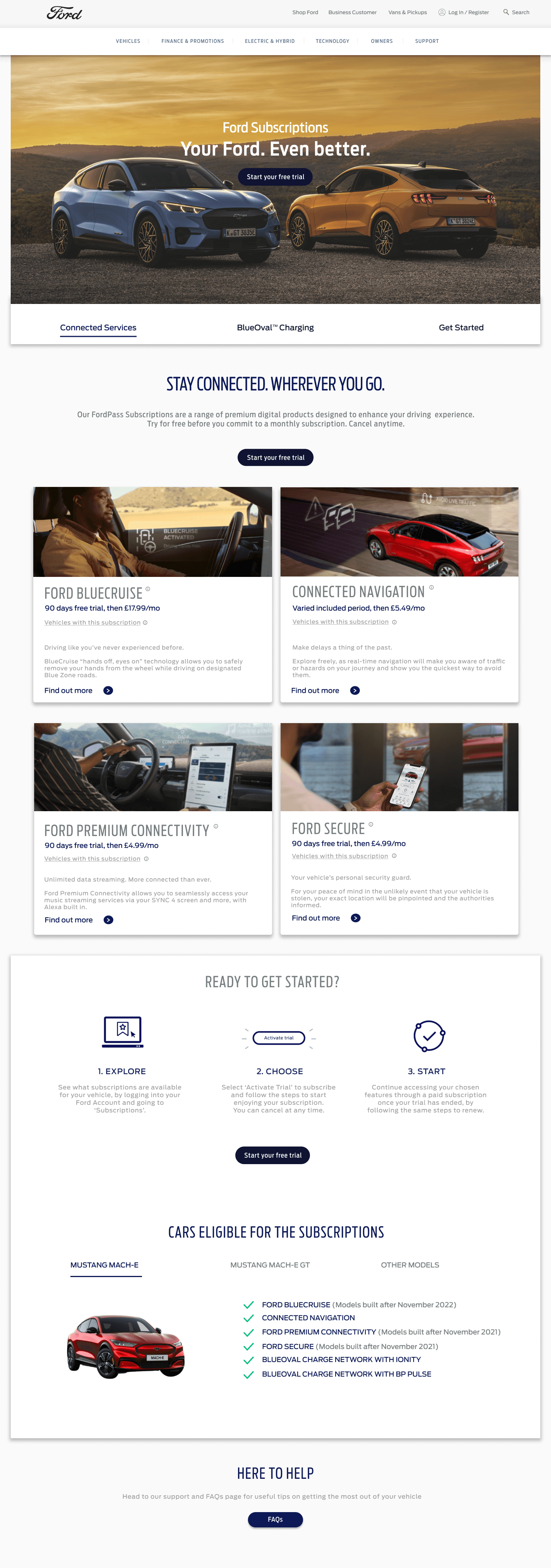
2️⃣ Second, the structure and organization of the page were enhanced using a horizontal in-page navigation bar and a 2x2 content display grid.


3️⃣ Finally, important key information, such as descriptions and car availability, was added to eliminate confusion, and ‘Start free trial’ buttons were highlighted with an orange hover effect to draw attention.


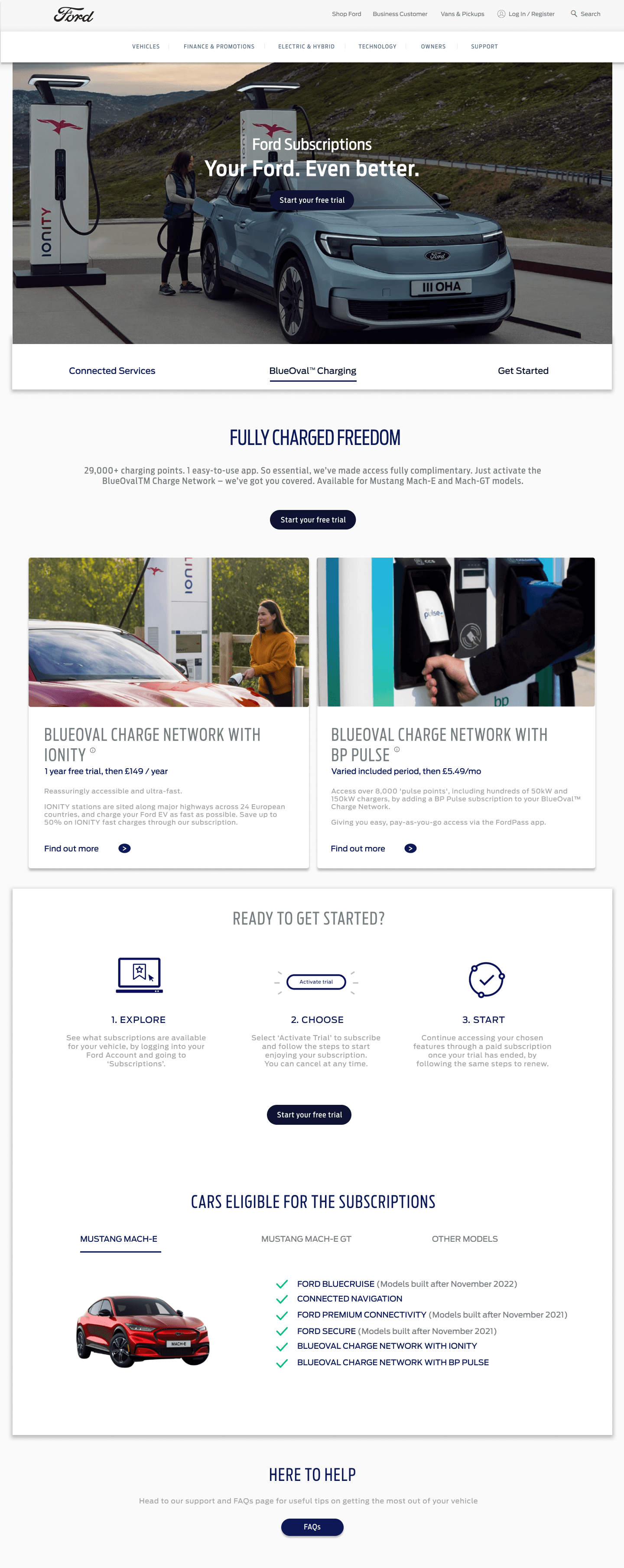
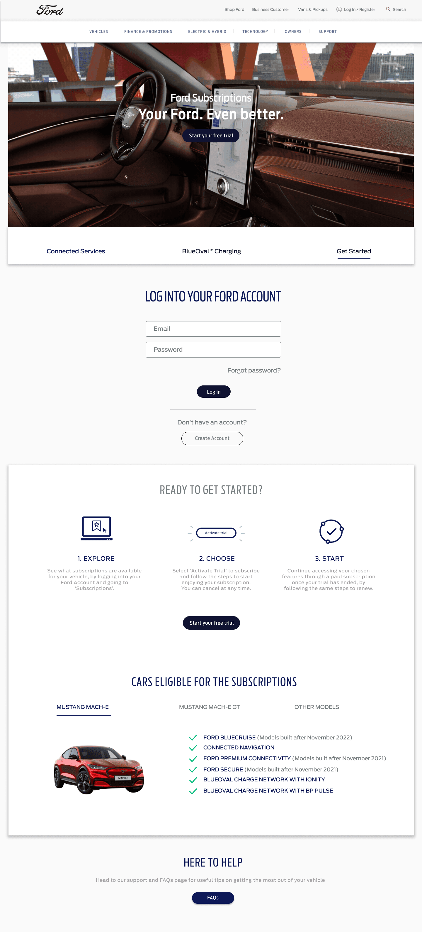
… Okay but what about the before?

… Okay but what about the before?

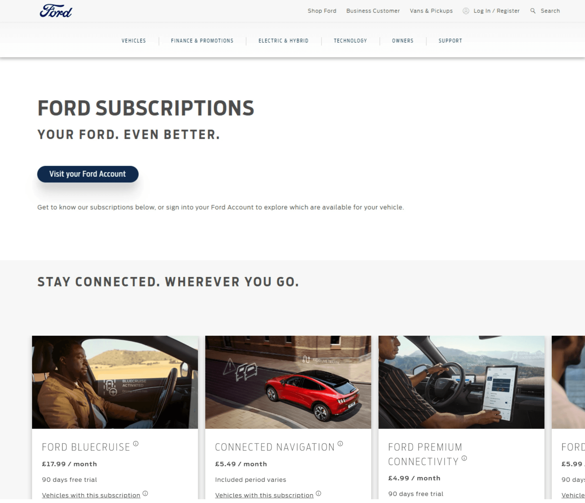
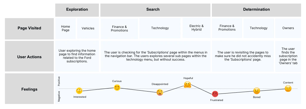
In order to redesign the page, I put myself in the shoes of a EV car owner browsing on the Ford website. I set myself the task to find the subscriptions page.


I discovered several problems:

❌ The Subscriptions Page is not visible or intuitive to access (nested under 'Owners');

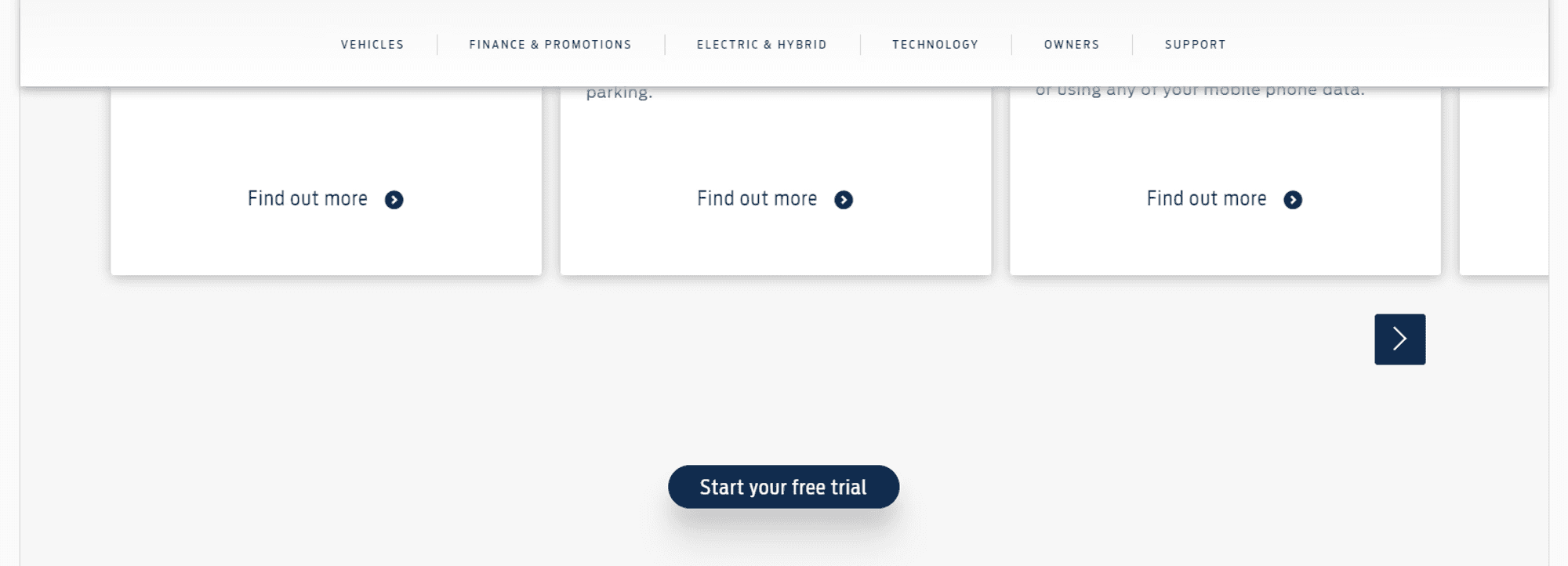
❌ The navigation in-page, as well as some interactive elements cause frustration;

❌ The page lacks clarity of key information (.e.g car eligibility, benefits);

❌ The amount of blank space affects readability.

💻 Usability Test

💻 Usability Test

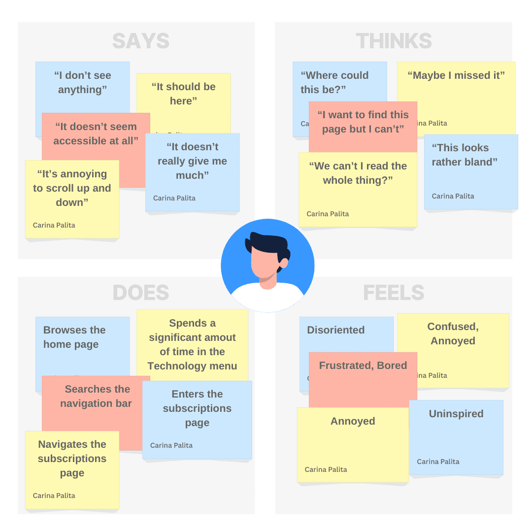
Due to time constraints, a single usability study was conducted. The participant (27M) was chosen due to his ability to drive and familiarity with various car manufacturers.


Several questions were asked during the usability study:

“Can you locate the subscription page?”

“How did you find this experience?”

“How would you go about starting a free trial”?

“How would you improve this experience?”

👤User Persona

👤User Persona

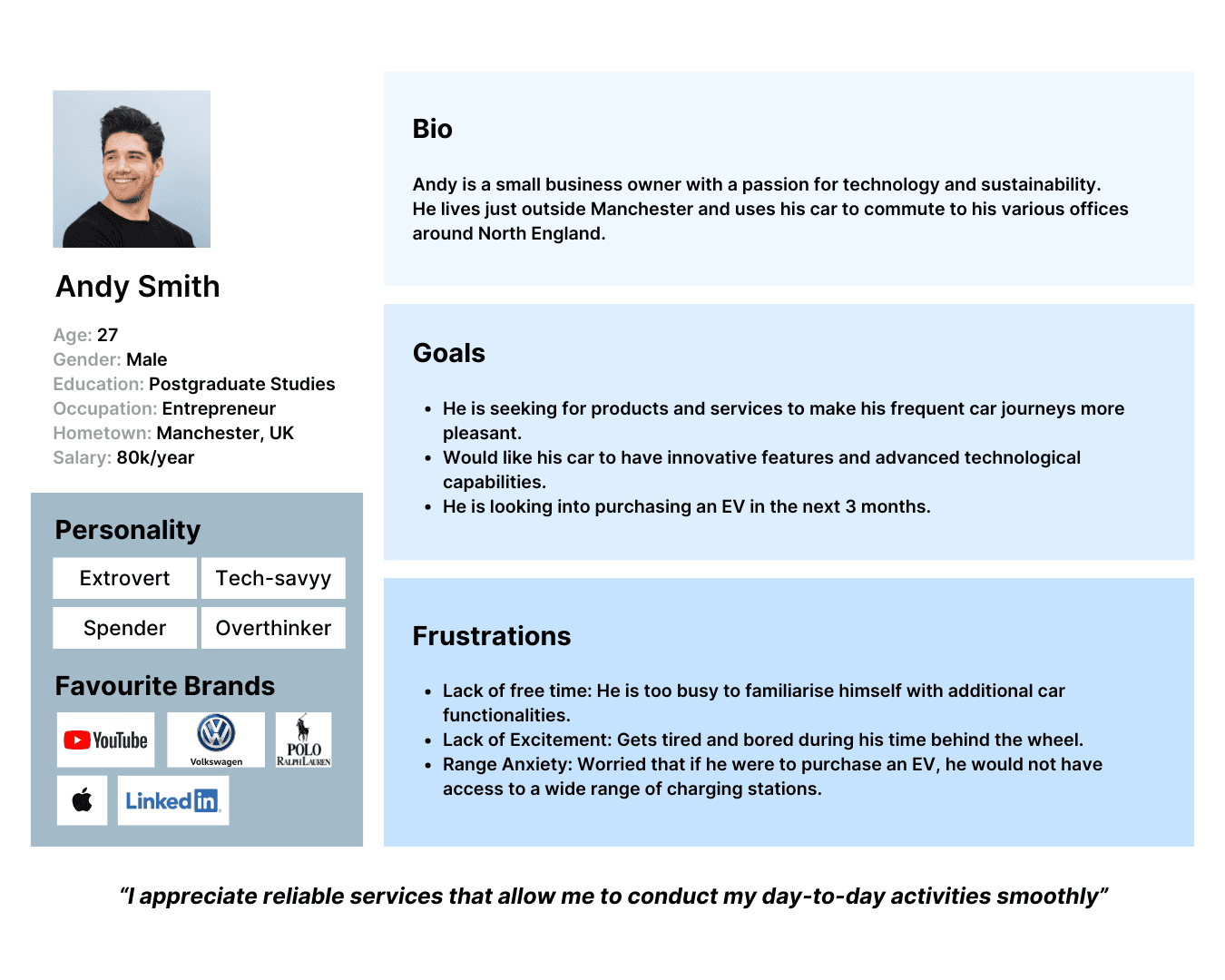
Due to project constraints, only one user persona was generated for this project. The persona reflects the individuals interested in purchasing an EV, that would be excited by additional features on demand and access to a large network of charging stations.

Due to project constraints, only one user persona was generated for this project. The persona reflects the individuals interested in purchasing an EV, that would be excited by additional features on demand and access to a large network of charging stations.

🛤 User Journey

🛤 User Journey

💡Ideation

💡Ideation

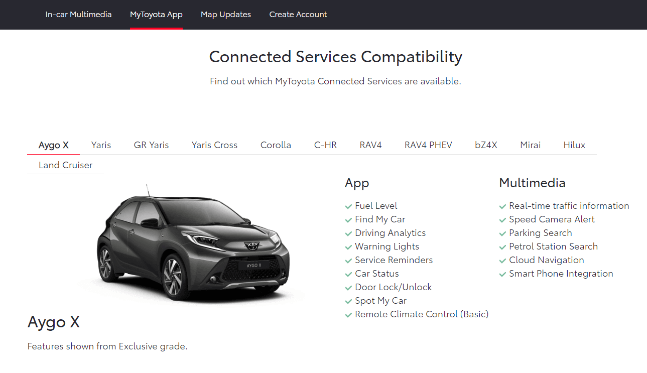
Due to similarities in target audiences and vehicle upgrades services, Toyota, Audi, Vauxhall and Volkzwagen were benchmarked against Ford.


A heuristic analysis was conducted and the following common strengths were identified:

✔️ Horizontal in-page navigation is preferred for quick and intuitive access to the contents of the page;

✔️ A clear overview of benefits, features available and cars eligibile for the subscriptions is prioritised;

✔️ There is an emphasis on placing elements in an aesthetically pleasing and balanced way.

🗒 Wireframes

🗒 Wireframes

🗒 Final Designs

🗒 Final Designs

Currently I’m open to new opportunities and projects.
Feel free to reach out ;)

Currently I’m open to new opportunities and projects. Feel free to reach out ;)

Currently I’m open to new opportunities and projects.

Feel free to reach out ;)