
Brand Identity and Web Design // Client Project
Brand Identity and Web Design // Client Project
Building the Cultured Mentor brand
Building the Cultured Mentor brand
Building the Cultured Mentor brand




🙌 Overview
🙌 Overview
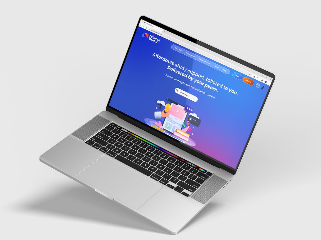
Cultured Mentor is a peer-to-peer mentoring platform designed for students to earn some additional cash while teaching others subjects they're really good at. The founders reached out to me in my time as Head of Marketing at the leading student start-up accelerator in the UK.
Cultured Mentor is a peer-to-peer mentoring platform designed for students to earn some additional cash while teaching others subjects they're really good at. The founders reached out to me in my time as Head of Marketing at the leading student start-up accelerator in the UK.
💥 Challenge
💥 Challenge
The challenge of this project was to design a memorable brand identity that is friendly and approachable, yet still serious enough to convey trust. The founders wanted the brand to feel like that "big responsible sibling".
The challenge of this project was to design a memorable brand identity that is friendly and approachable, yet still serious enough to convey trust. The founders wanted the brand to feel like that "big responsible sibling".
👑 My role
👑 My role
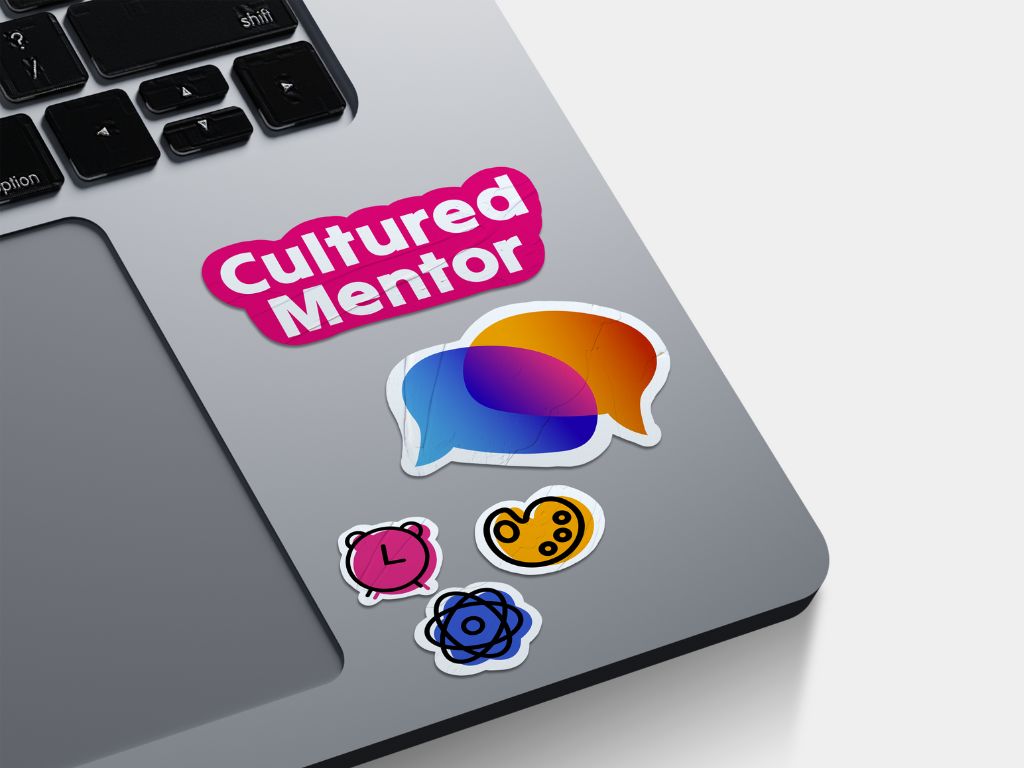
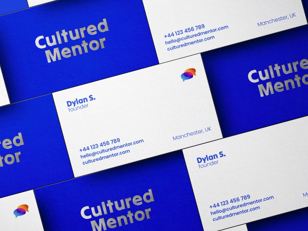
For this project I was initially contracted only as a visual identity designer. I delivered a full brand idendity (including logo suite, patters, icons, collateral). After the project was completed, the founders reached out again for the UI design of the website.
For this project I was initially contracted only as a visual identity designer. I delivered a full brand idendity (including logo suite, patters, icons, collateral). After the project was completed, the founders reached out again for the UI design of the website.
🧠 The Concept
🧠 The Concept
For this project I went for the symbol of speech bubbles. This is super significant to the brand, as teaching and learning require extensive ammounts of communication. I overlapped the bubblesto illustrate the concept of collaboration and idea exchange.
For this project I went for the symbol of speech bubbles. This is super significant to the brand, as teaching and learning require extensive ammounts of communication. I overlapped the bubblesto illustrate the concept of collaboration and idea exchange.






✒️ Typography
✒️ Typography
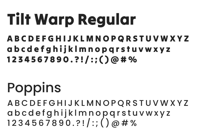
During our discovery call, all founders agreed that they wanted their brand identity to be more friendly in terms of colours and icons, but on the more serious side in terms of typography. For the primary font I chose Tilt Warp Regular, a display sans serif font ideal for clean logos and designs.
Because the primary font was so bold, the secondary font had to be variable. I went for Poppins, a clean sans-serif typeface family, due to its versatility.




🎨 Colour Palette
🎨 Colour Palette
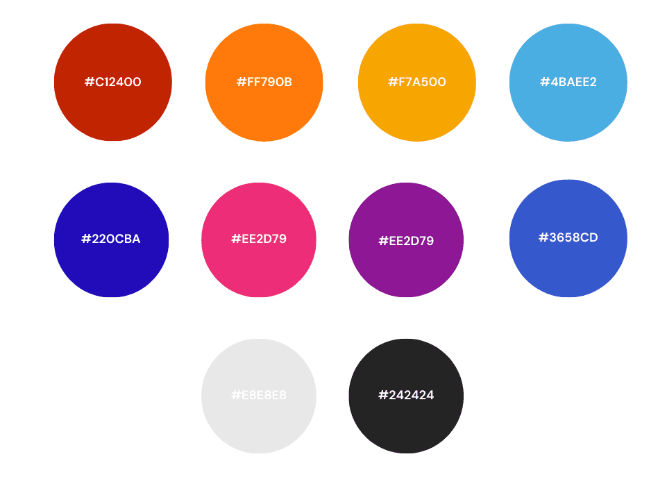
The foundes expressed their preference for blue, yellow and orange as potential primary colours. I decided to start exploring potential colour combinations that would accommodate thei preferences. I settled on 2 combinations: warm ( red, orange, yellow) and cool (blues, purple, pink) which ended up becoming symbolinc to the mentor-student idendities. The cool side represents the mentors - serious, trustworthy and calmn; whlist the warm side represents the students - fiery, energic, eager to learn.


